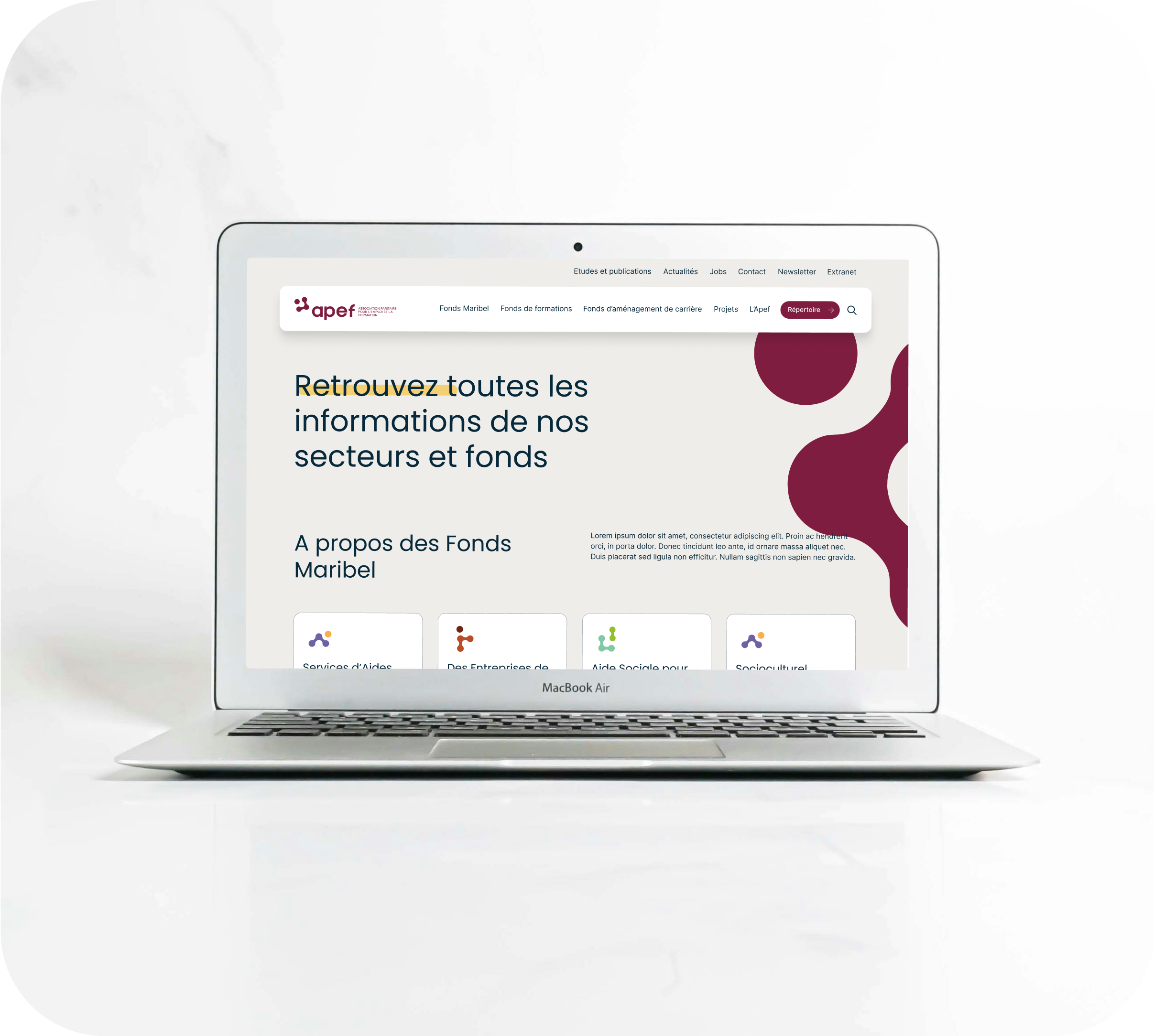


CBTW’s product design team recently partnered with Apef (Association Paritaire pour l’Emploi et la Formation), a non-profit organization focused on creating connections between the socio-cultural and educational sectors. The project began as a simple logo refresh, but evolved into a more comprehensive rebranding effort that reflects Apef’s values and mission in a modern and human-centered identity.
This case study explores how CBTW helped transform Apef’s visual identity with a strategic and collaborative approach focused on inclusivity, accessibility and connection.
Comprehensive approach to rebranding
Rebranding a non-profit like Apef required a deep understanding of its role as a connector between sectors. CBTW’s methodology focused on evolving Apef’s visual identity while maintaining the core elements of their mission.
- Workshops and stakeholder engagement
Objective: To gain a clear understanding of Apef’s mission and the intricate connections they facilitate between sectors such as socio-cultural, educational, and artistic institutions.
Methods: Through workshops with key stakeholders, we explored how Apef is perceived internally and externally. These sessions gave us critical insights into their values and role in fostering connections between different sectors, which informed the design process.
- Audience Analysis and Visual Concept Development
Objective: Ensure that the brand resonates with different audiences, from government agencies to local socio-cultural actors.
Methods: We analyzed Apef’s target audience, which includes individuals and organizations from different socio-cultural backgrounds. This analysis guided the creation of a visual identity that would communicate inclusivity, connection and accessibility.
- Logo redesign and visual identity
Objective: To modernize Apef’s logo while maintaining key elements of its original identity.
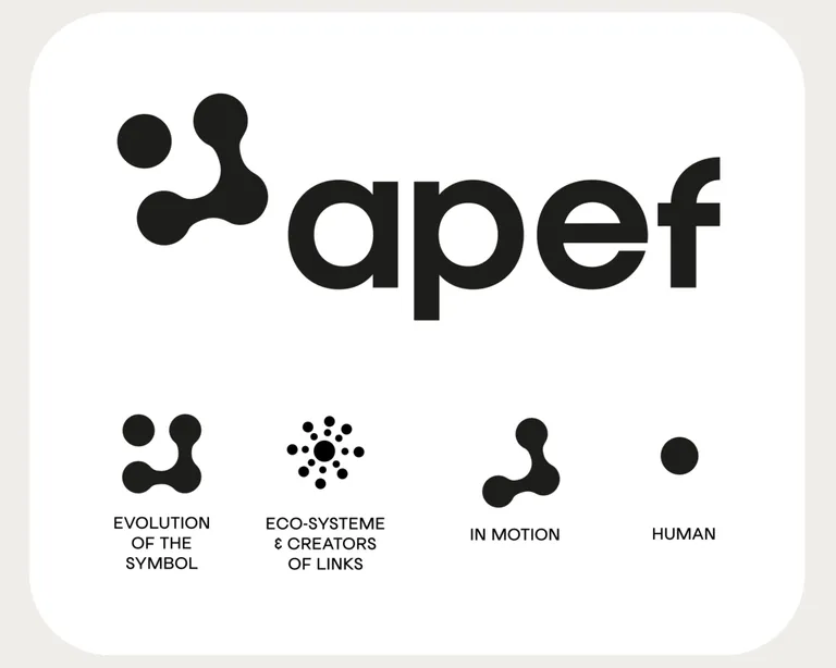
Methods: The original logo, shaped like a puzzle piece to symbolize Apef’s role in connecting sectors, felt dated. We preserved this concept by evolving the puzzle metaphor into a circular chain, reflecting Apef’s central role in an ecosystem of collaboration. The new design uses rounded shapes and soft edges to emphasize a human touch and avoid any bureaucratic associations.
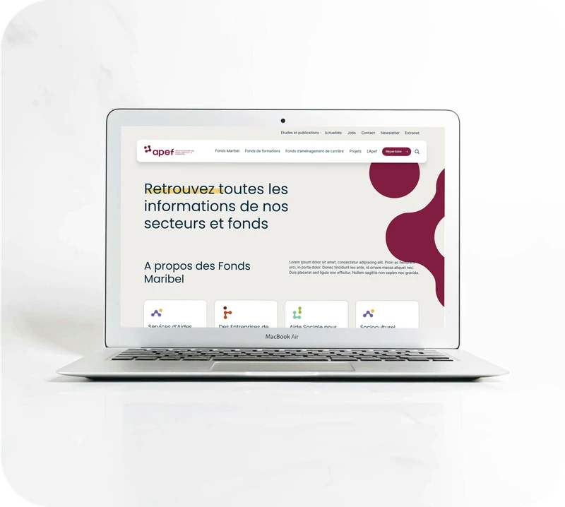
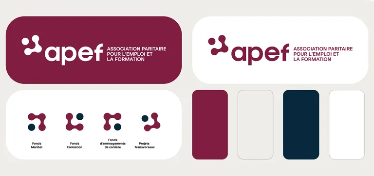
Typography and colors: We chose Poppins for titles and Inter for body text, both rounder sans serif fonts, to reflect Apef’s approachable and human-centered nature. The color palette included a deeper, more vibrant burgundy and a softer beige, complemented by a dark blue for text to enhance readability and professionalism.
- Brand guidelines for flexibility
Objective: Provide Apef with the tools to maintain consistency in its visual communications across platforms.
Methods: A concise brand guideline was created to provide flexibility, allowing Apef to adapt their brand across various digital and physical touchpoints while maintaining consistency. This guideline included specifications for logo usage, color schemes and typography, ensuring that Apef’s identity remained consistent yet adaptable.
The Collaborative outcome of the modernized branding
Apef’s previous branding was outdated and no longer resonated with their evolving audience. They needed a modernized identity that retained the essence of their mission-creating connections between sectors in education, culture, and employment.
Through workshops and iterative design processes, we aligned the new branding with Apef’s mission. The reimagined puzzle icon emphasizes collaboration, while the human-centered design promotes accessibility. The logo is adaptable across multiple platforms, ensuring flexibility for digital and physical applications.
Impact of the new Branding
- Increased recognition: The updated brand is more approachable and visually cohesive, improving recognition among stakeholders.
- Stronger communication: Apef’s values and mission are now more clearly reflected in its visual identity, making it easier for partners and sectors to understand its role.
- Client satisfaction: Apef’s leadership expressed satisfaction with the process and outcome, particularly the way the new brand remained true to their roots while modernizing their image.
Next steps
CBTW’s web and CMS development team will now develop Apef’s new website, fully aligned with the updated branding. This digital transformation will enhance Apef’s online presence, streamline communication with its audience, and improve access to resources such as its training catalog and sector initiatives.
Conclusion
At CBTW, we take a comprehensive approach to branding, from initial workshops to platform development. This success story with Apef highlights the value of our strategic methodology in redefining branding for nonprofits. Whether you need a logo refresh or a complete digital transformation, CBTW’s expert methodology ensures a meaningful and impactful rebranding process.
For more information on how CBTW can support your organization’s rebranding and digital transformation, contact us today.